PRODUCT PACKAGING
PRODUCT PACKAGING
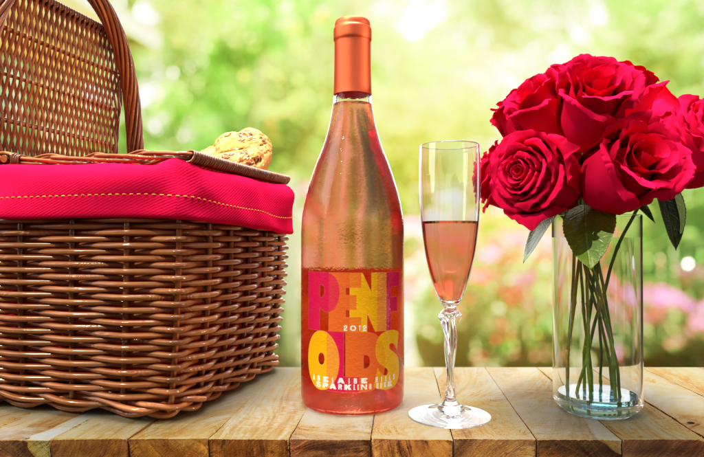
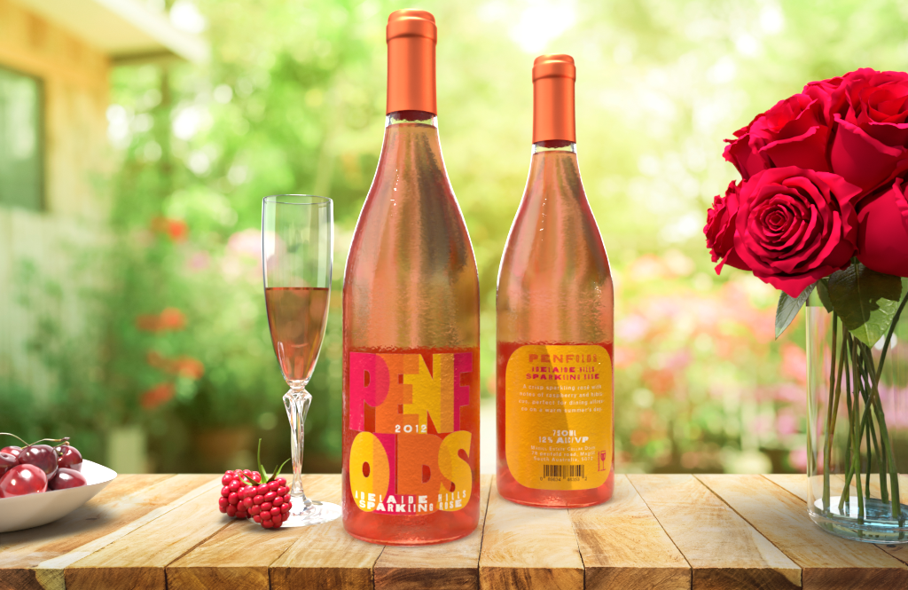
Penfolds Wine
personal project
For this project I created a fictional wine for Penfolds. I wanted to create something that was different than their usual product; with a reputation for high quality wine and class, I knew I could create somethingcontrasting, yet still high quality.
In South Australia, wineries are a popular destination on weekends for young professionals. I wanted to create something fun and summery for when they are out with friends. Natural wines are also popular with young adults, so to appeal to this audience, I chose a sparkling rose.
The label is more influenced by modern art than contemporary design, to reflect the timelessness of Penfold’s products.
The label is made using Adobe Illustrator and the mock-up us made in Adobe Dimension.
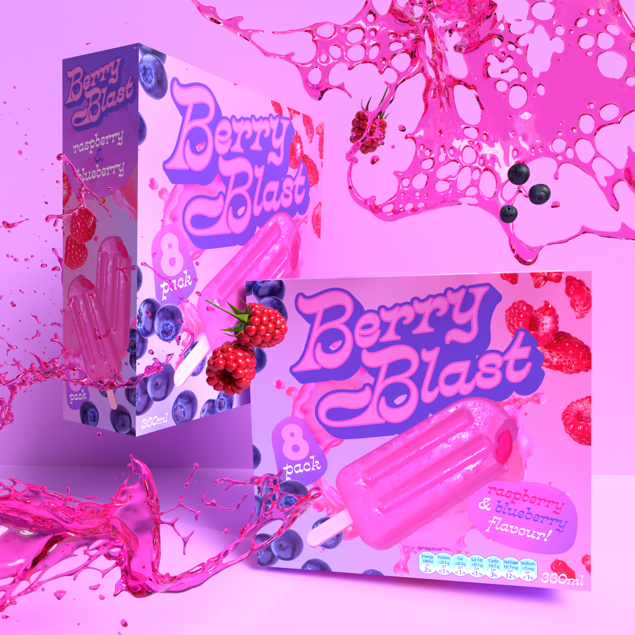
Berry Blast Icypole
personal project
This project involved desiging my own icypole product packaging.
The target demographic for my product was primarily children, and thus the use of eye catching colours. The product is takes centre stage and the retro rocket-like typeface also suggests motion and play.
While being a product for children, it is also important that my product appeals to parents as they will be the ones buying the product. Most parents don’t expect icy treats to be healthy, but to be more appealing to a health oriented demographic I included fresh fruit imagry. The softer pinks and purples are also similar to healthier frozen treats such as sorbet and frozen yogurt.
The icypole and mock-up were rendered in Dimension, the packaging components were made in Illustrator and then combined in Photoshop.